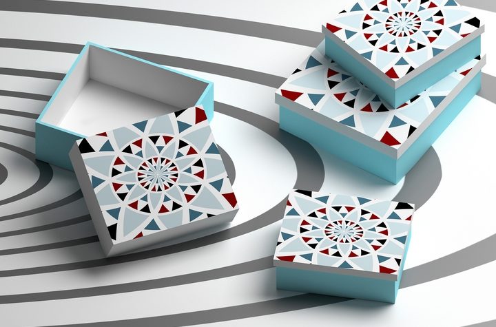
The retail industry is full of innovative ideas, especially when it comes to packaging design trends. This is evident every time you step inside a retail store, where you are greeted by the most unique and creative packaging supplies. From dynamic shapes to exuberant colours, these retail products have design components that capture your attention and leave a lasting impression.
As with any kind of trends, the latest packaging design trends are always evolving. Recently, there are certain design elements that have surged in popularity. It could be worthwhile to examine these industry trends, understand their impact, and adapt a few of the ideas into your next packaging design.
Here are six latest packaging design trends that have emerged in the retail industry:
Trend #1: Minimalist Chic
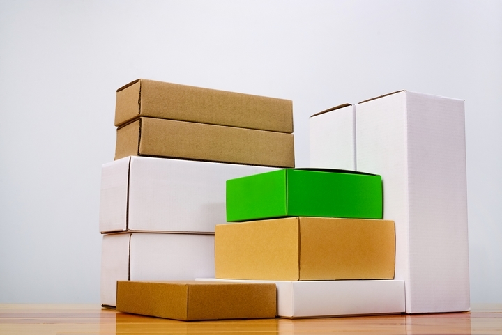
We live in a highly competitive retail market, saturated with tons of products that fiercely compete against each other for the customer’s attention. Every product wants to be the boldest, the brightest, and the loudest in a very crowded market space. However, this isn’t always what the customers resonate with. Sometimes, it’s better to take a relaxed approach and go for a clean-cut minimalistic packaging design instead.
The idea is to keep your retail packaging as clean and clear-cut as possible. A simple packaging helps customers to understand the product immediately. That means no outlandish colour combinations, no frivolous accessories, and basically nothing else that can distract your attention. Instead of looking at all the busy design elements, you direct the customer’s attention onto the product itself. Uncluttered designs can communicate the brand’s message to your target audience in a clear and direct way.
Trend #2: Pastel Colours
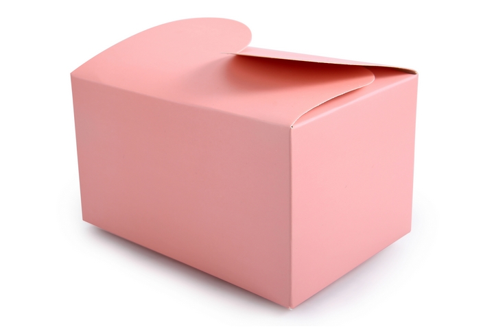
A minimalistic approach might be effective, but sometimes you still want to bring the packaging to life with a splash of colour. Your first instinct might be to choose a bright colour that makes a strong visual impact. However, pastel colours have been gaining in popularity as a direct response to all the vibrant colours you see in retail packaging. These neutral colours almost serve as a palate cleanser, creating a soothing and calming effect on the customer.
Pastel colours communicate a message of candid warmth. Packaging in these colours will appear calm and neutral without screaming for attention. Some of the more commonly used pastel colours include baby blue, lavender, periwinkle and magic mint. These colours have made a comeback in most packaging design trends, and they are likely to be around for quite some time.
Trend #3: Bold Colours
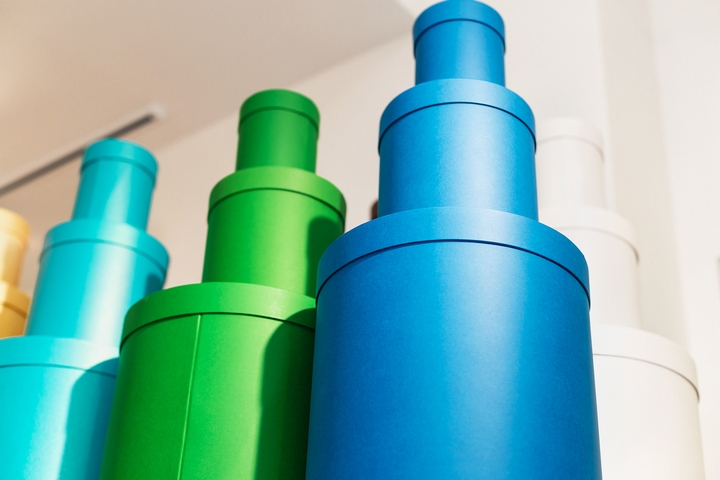
Just because pastel colours are gaining in popularity doesn’t mean bold colours are any less popular or effective. In fact, using bright impactful colours has remained a steady trend in packaging design. By combining the bright colours with vibrant shades, you can create a visually appealing packaging that stands out from other competing products.
Bold colours can be used in many exciting combinations, but it’s best to pick a colour that evokes emotions in your customers. Shades of dark red can signal passion and romance. Shades of bright yellow can give off a happy and optimistic vibe. Shades of vibrant orange can translate to energy and enthusiasm.
Trend #4: Custom Fonts
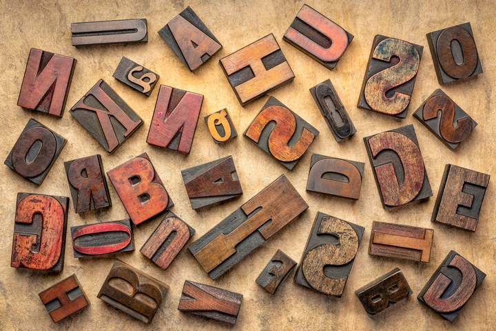
There will likely be a series of words printed on your retail packaging. You may be limited to using the classic and traditional font styles, which are safe but not necessarily innovative. Let’s face it, the Arial font has never excited anybody. However, you can make your packaging distinctive and unique with a custom font style that matches your brand’s personality. Custom fonts evoke the feeling of a handmade product, which your customers may associate with wholesomeness and nostalgia.
Custom fonts used to be a novelty concept, but they have become a more mainstream trend in packaging design recently. With the help of digital technology, it became a lot easier to create your own font by scratch and apply the results onto the packaging. For handwritten custom fonts, the letters may be in different sizes and the words aren’t always spaced out evenly. There’s a feeling of raw imperfection to the custom font style, which adds to the authenticity of your product packaging.
Trend #5: Cool Patterns
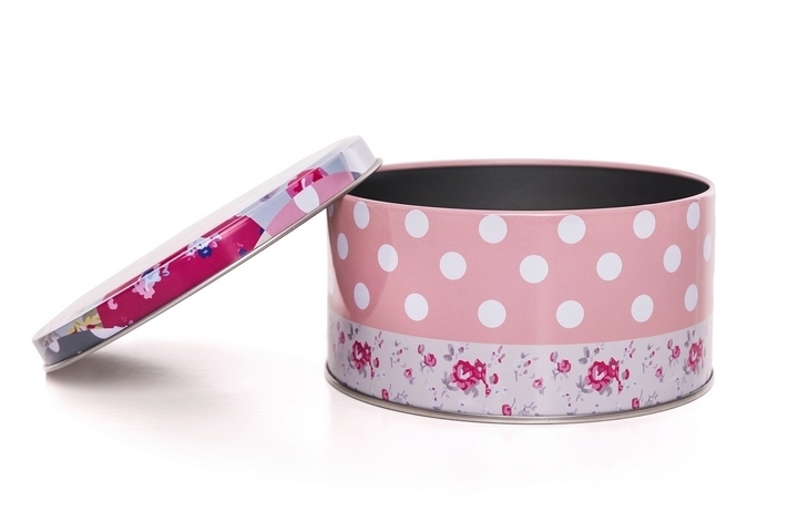
Repetition has a way of creating amazing graphic designs, which can be applied to packaging designs. The repetition of beautiful patterns, which are usually colourful in most cases, is one of the popular packaging design trends. This isn’t a new technique by any means, but there are always new patterns to be discovered and the design possibilities could be endless.
The repetition of visual motifs helps to create a strong brand message in your packaging identity. Patterns aren’t just limited to stripes and polka dots, although they are quite popular choices in packaging design. You can also explore different patterns with other interesting shapes, or even draw your own design and apply the pattern onto the packaging.
Trend #6: Unique Shapes
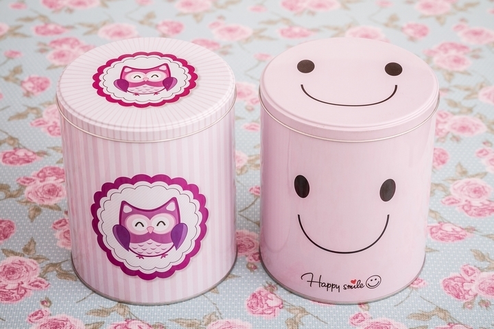
Retail packaging used to be designed in very traditional shapes. For many products, we have grown accustomed to packaging designs that are only manufactured in one typical shape: the rectangular box. As a result, a lot of packaging have the same uniform shape, often with the identical dimensions and sizes as one another. The packaging looked like the same shapes all the time, so it wasn’t exciting the customers in any way.
Lately, it has become popular to experiment with different shapes for the product packaging. An unusual shape, especially when it is vastly different from your competitors’ designs, will stand out on a store display. The aim is to pick a distinctive shape that catches the customer’s attention as quickly as possible, such as a cylinder or a prism. You can also experiment with the packaging dimensions, increasing or decreasing the width and height from the standard norm.

